Psst
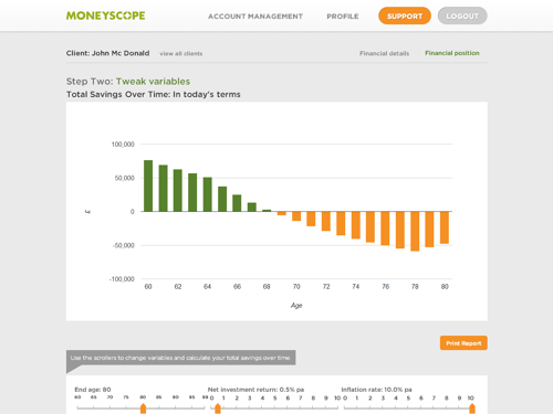
We’ve got two projects on the go at the moment which are due to go live soon: one is the release of a new problem-solving feature that we’re building (which Richard described in a recent webcast); the second is a subtle evolution of the screen designs (pictured above).
Regular users of Moneyscope will recognise the screen above and, if that’s the case, we think you’ll be pleased to see that the bar chart now has one colour when a plan is in the black and one when it’s in the red.
But how come the bars are orange when you’re in the red?
Well, the screen designs might not seem like a radical shift but we’re seeking to improve the clarity of Moneyscope’s layout by improving the way we use type, forms and colours.
By reducing the number of colours we’re using on a screen, our ambition is to make Moneyscope that bit easier to ‘read’ at a glance and, therefore, navigate.
When you come to print out a report, however, Moneyscope will keep the green bars green, but the orange bars will become red so your clients get a report where their cash is either in the green or in the red.
(At least, that’s what we’re working towards at the moment.)
It’s the kind of thing that pixel-perfect people like us get very exercised about, but what do you think? Are you happy for negative values to be displayed in orange on screen, and then displayed in red in print?
Just post a comment below to let us know what you think. But hurry because we’re cracking on with the work!